A Streetcar Named Desire scene - http://www.youtube.com/watch?v=S1A0p0F_iH8
Theme - The movie both criticizes the traits of rudeness and over-honesty, while also demonstrating that those who have these qualities are oftentimes the ones who receive what they want in life. This theme is actively explained as the audience is left to determine for themselves who in the story represent the character types analyzed. Stanley, a coarse lower-class man, calls out for his wife Stella, who came from an upper-class background, after he feels remorseful for beating her. He acts obnoxiously and brutish, but is able to coax his wife back even though he hasn't learned any lesson.
In this scene, many actual lines are used, primarily curvelinear ones, at the top of the staircase where Stella has escaped from Stanley. Metaphorically, she has gone to a more rational, mannered place than the ground where Stanley is, and the soft quality of the lines emphasize these traits. Stanley's shoulders and face have sharp lines and contrast the curved lines at the top of the stairs. The contrast in direction of line between Stanley's shoulders and his torn tank top represent his torment in losing his wife.
The shape of the staircase is twisted into an almost helix-like shape, which uses more curved lines and represents the more cultured place to which Stella has gone. The shapes of Stella and Stanley also represent their respective classes, as Stanley is squarely shaped, suggesting his ruggedness, while Stella wears a dress that underscores her curved figure.
The main use of space in this scene is in the great distance between Stanley and the upper deck to which he is calling. He has acted brutishly and is far below the reason that the porch represents. This distance is suggested when he has to call Stella very loudly.
The lacy pattern of the shapes on the deck have a consistent visual rhythm, along with Stella's slow steps down the staircase and Stanley's slow jog at the very beginning of the scene.
The main movement in the scene comes from Stella, with her slow walk out of the apartment and down the stairs. Her slow, steady movements, along with her stopping at the top of the staircase before descending to meet Stanley, shows tension and release as one expects her to reach the bottom of the stairs, yet she delays these expectations.
Friday, March 9, 2012
Blog Assignment #7
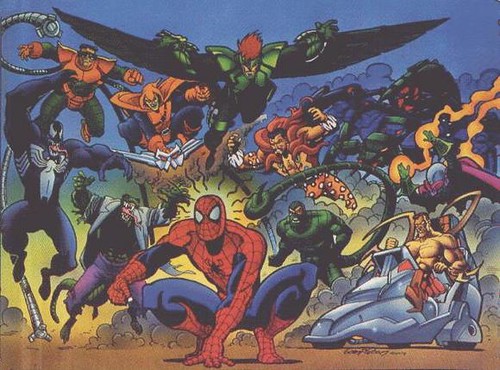

These pictures are both similar and alike in terms of color. Both images use a variety of similar hues, drawing on shades of blue, red, green, orange, yellow and black, intended to portray a state of chaos. The brightness of both scenes are very different, however, in large part due to their different animation styles. Spiderman originates in the United States and uses a serious comic-book style of animation, while Astro Boy is a Japanese cartoon and exhibits traits similar to anime. Superhero comic books with a dark theme tend to use more realistic and less bright colors, while anime characters typically shine and are drawn with visible light effects, and therefore the Astro Boy picture is much more bright than the Spiderman image. In keeping with Spiderman's more serious tone, the colors are generally less saturated and distinct than those of Astro Boy, however both pictures use more value for the villains than the heroes.
Lighting also plays a large part in distinguishing between the two images. Shadows are everywhere in Spiderman's image, especially in the top part of the screen. The sky is nearly black, the villains are drawn dark up against the sky, and the little light in the picture is behind Spiderman. In an image so dominated with villians, shadows are representative of the grimness of the Spiderman universe. The Astro Boy picture uses shadows more subtly, such as on the villain and the rocks, and are mainly to make the scene appear lit from the explosion at the bottom of the screen. The Spiderman picture also uses more symbolism. The smoke and the dark sky in the background behind the villains represents how they are a sudden and unexpected threat. The little bit of bright yellow behind Spiderman emphasizes his heroism. Spiderman is sensing his enemies with the rays that come out of his head, but the arc that they form is similar to a halo, which also symbolizes his goodness. Astro Boy is at the right and larger in his image than his enemy, which is left-center and smaller, representing the concept that Astro Boy can stay one step ahead of his enemy. The confused multitude of colors rushing by him also represents the confusion and chaos of a battle. In terms of mood, both images display a tumultuous scene, but Spiderman's image is more gloomy while Astro Boy's is intense.
Blog Assignment #6
Video - http://www.youtube.com/watch?v=OX1Yj-fhiTA
(Note: I used the first 5 unique shots of the scene, instead of strictly the first 5 shots, as a few shots were repeated.)
The 180 degree rules are followed throughout this scene. The first shot of Cameron in the center establishes the 180 degree line running through him, toward the camera, and the next shot rotates about 120 degrees to the left to show Cameron, Ferris and Sloane. After this, the camera moves back to its original position facing Cameron, before going behind his right shoulder, which is as far as the camera can go without crossing the 180 degree line. The camera once again goes back to the first shot, and then repeats the wide shot showing all three characters. As Cameron begins to walk in front of the car, the camera dollys right and slightly forward. A new 180 degree line is established running through Ferris toward the camera, before going behind Ferris’ right shoulder.
The Rule of Thirds is broken a couple of times, but in both cases this is justified. In the second shot, the wide shot including all three characters, Ferris and Sloane are on either side of where the right vertical intersection is, but in the context of the scene this works. Cameron is the main focus and is exactly on the left horizontal intersection, but Ferris and Sloane have lesser and equal importance, so they are left off this intersection to keep one of them from seeming more important than the other. The other time the Rule of Thirds is broken is when the camera returns to the original shot of Cameron for the third time, as he is almost exactly in the center of the shot. This is also acceptable because he is the only focus of the shot and the camera slightly zooms in on him to emphasize this. As for the Rule of 30, every new shot moves the camera by at least 30%.
This scene is well-shot, cutting back and forth between Cameron and his friends in sync with the content of his lines. This scene is a Cameron monologue, so the only shots of Ferris and Sloane are to show their reactions to what he says, and they are appropriately de-emphasized based on the way the shots are set up.
 |
| First shot storyboard |
 |
| First shot overhead |
 |
| Second shot storyboard |
 |
| Second shot overhead |
 |
| Third shot storyboard |
 |
| Third shot overhead |
 |
| Fourth shot storyboard |
 |
| Fourth shot overhead |
 |
| Fifth shot storyboard |
 |
| Fifth shot overhead |
Thursday, March 8, 2012
Blog Assignment #5
"Don't Let It Bring You Down" by Neil Young - http://www.youtube.com/watch?v=uG1HY2zLc1s
Annie Lennox's cover version - http://www.youtube.com/watch?v=-1x6u1rkxS4
Tempo [slow, medium, fast]
Medium, Moderato
Acoustic guitar strumming
Steady, syncopated
Acoustic guitar
Intro/Verse/Chorus/Verse/Chorus/Bridge/Finale
See attached paint file
Tempo [slow, medium, fast]
Same as before, steady and syncopated
Emotional architecture -
Annie Lennox's cover version - http://www.youtube.com/watch?v=-1x6u1rkxS4
Neil Young version
LISTENING PHASE 1 (Rhythm) Tempo [slow, medium, fast]
Medium, Moderato
Source [where is the rhythm coming from?]
Acoustic guitar strumming
Groove [describe how the personality of the rhythm]
Steady, syncopated
LISTENING PHASE 2 (Arrangement)
Instrumentation [which instruments drive the song?]
Acoustic guitar
Structure/Organization [how is the song built? Order, patterns, etc.]
Intro/Verse/Chorus/Verse/Chorus/Bridge/Finale
Emotional Architecture [Draw how the song build and drop?]
See attached paint file
LISTENING PHASE 3 (Sound Quality)
Balance
- Height [high and low of frequency]
Medium-pitched frequencies throughout- Width [stereo panning left/right]
None, same sound heard in both left and right speakers
Depth [layers of instruments - via loudness
Not deep, only acoustic guitar and voice
Annie Lennox version
LISTENING PHASE 1 (Rhythm) Tempo [slow, medium, fast]
Slow, Andante
Source [where is the rhythm coming from?]
Drums and voiceGroove [describe how the personality of the rhythm]
Same as before, steady and syncopated
LISTENING PHASE 2 (Arrangement)
Instrumentation [which instruments drive the song?]
Drums, synthesizer, piano, bass guitar, harp, strings
Structure/Organization [how is the song built? Order, patterns, etc.]
Intro/Verse/Chorus/Verse/Bridge/Piano solo/Verse/Piano solo/BridgeEmotional Architecture [Draw how the song build and drop?]
See attached paint file LISTENING PHASE 3 (Sound Quality)
Balance
- Height [high and low of frequency]
Reaches high frequencies often, occasional low frequencies- Width [stereo panning left/right]
Vocals in left ear at end, piano in right
Depth [layers of instruments - via loudness
Very deep, many layers of instruments
Emotional architecture -
 |
| Neil Young's song |
 |
| Annie Lennox's song |
Neil Young’s song “Don’t Let It Bring You Down” and Annie Lennox’s cover keeps the same melody but are drastically different in tone and arrangement. Beginning with the first level of the listening framework, the tempo varies between the two, both keeping consistent throughout but with Young’s version maintaining a more moderato tempo instead of the andante speed of Lennox’s version. The source of the groove is another variation, as Young keeps the rhythm with his guitar strums while drums keep the beat in Lennox’s cover. Both songs keep a very steady and syncopated groove.
In the second level of the listening framework, the instrumentation is drastically different. Young only uses an acoustic guitar, while Lennox’s version sounds very “produced,” using many varieties of instruments to create a dense sound, such as synthesizer, harp, bass guitar, and strings. The organization in Young’s song is straightforward and common, while Lennox adds embellishments like a verse repetition and a piano solo at the end. The emotional architecture for both songs is similar in their lack of substantial change, but Lennox’s version builds slightly more at the end with the added instrumentation.
Annie Lennox has more intense sound quality in all three areas of the third listening framework. The height of Young’s version is very middling, as both his voice and guitar fall into this range. Lennox’s version has a great amount of height, using bass guitar for the low range of frequencies and high piano notes for the top of the frequency range. Lennox’s song takes advantage of width while Young does not, separating certain instruments to different speakers at the end of the song. As was explained before, her version has more depth as well, using a multitude of instruments while Young only utilizes acoustic guitar.
I am partial to both versions of the song, but I prefer Annie Lennox’s cover to Neil Young’s original. I believe that the melody of the song is more suitable for the soft, dreamlike arrangement and tone created by Lennox. I suppose that my preference for larger, more varied instrumentation is also a factor. However, I like Neil Young’s version as well simply because I play acoustic guitar and appreciate the resulting sparse sound by use of that one instrument.
Subscribe to:
Comments (Atom)